Increasingly, instructors are looking for ways to engage learners in their courses while relaying critical information to them, such as a syllabus, to help set them up for success. One way to do this is through the use of a graphic syllabus, or infographic syllabus.
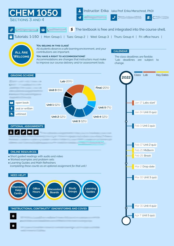
Infographics combine text and visuals (images, illustrations, charts) to present a cohesive story; in this case, course requirements. Here is an example from Erika Merschrod via Twitter:
Focusing on students’ primary interests in a syllabus (course policies and expectations, and a schedule of activities and assignments), Kaur (2021) reviewed the contents to identify parts that could be presented visually. Rudimentary references to university calendar, policies, and support centres were provided elsewhere in the online learning environment. Additionally, details of assessments were shared through the learning management system as well.
Remember that whatever you present visually in the infographic syllabus should have a text alternative to increase its accessibility. Providing a high quality downloadable PDF version of the graphic syllabus, with text alternatives for the visuals, can provide a suitable alternative. This print-based version can also look good, while being machine-readable for assistive technologies.
Universal Design Considerations
One other aspect to consider when designing your graphic syllabus is UDL (Universal Design for Learning). UDL on Campus highlights consideration for the syllabus to provide multiple means of engagement and action and expression. On California State University’s site UDL-Universe you can find a few helpful resources:
- UDL Syllabus Rubric: useful when reviewing or redesigning syllabus to identify degree to which the syllabus adopts UDL concepts.
- Examples of UDL-based infographic syllabi (MKT 490: Senior Marketing Internship, Elaine Young, Champlain College; ENGL 350 – Alaska Literature): give you a few ideas on how your infographic syllabus could be designed.
A core component of UDL, accessibility, is something that should be considered while designing or revising a syllabus. More information on an Accessible Syllabus may be found at AccessibleSyllabus.com.
Research on Graphic Syllabi
Some research has been done on the effectiveness of graphic syllabi. Kaur (2021) found that students strongly preferred the infographic syllabus, in comparison to a text-based syllabus. Students reported the infographic syllabus was ‘easy to use, memorable, organized, and engaging.’ Further, students noted they read the infographic syllabus more fully, were less anxious about the course and more comfortable with course requirements after using the infographic syllabus. (Kaur, 2021). Graphic syllabi have been shown to ‘promote greater retention of syllabus information’ by students (Mocek, 2017).
Infographic Design
Scott et al. (2017) outline principles of effective infographic design using the mnemic GRAPHIC.
- G: Get to Know Your Audience
- R: Restrict Colour
- A: Align Elements
- P: Prioritise Parts
- H: Highlight the Heading
- I: Invest in Imagery
- C: Choose Charts Carefully
Additionally, when preparing your design, think about your target audience’s preferences and what they would find engaging; have an external reader provide input; balance use of text and visuals; text should support the visuals in the infographic rather than repeat it; limit font types (3 max) and colour pallet (3-5); all colours should complement each othe, while having sufficient contrast to be perceivable (see the WebAIM colour contrast checker for more details); and be aware of and employ Gestalt laws in the design to catch readers’ attention while appealing to their cognitive process of interpreting the design and messages contained within.
Technologies for Graphic Syllabus Design
Graphic syllabi may be created with your presentation or word processing application, design-specific applications or other free apps which provide templates for infographic syllabi. A few online design tools frequently used to create graphic syllabi are:
Have a look at this article that reviews 12 infographic tools and specifies whether they’re free or paid, lists noteworthy features, etc. It also has several examples, which may be inspiring.
References
- Kaur, Angel W. (2021) “Dope Syllabus”: Student Impressions of an Infographic-style Visual Syllabus, International Journal for the Scholarship of Teaching and Learning, 15(2), Article 6. DOI: 10.20429/ijsotl.2021.150206
- Ludy, M., Brackenbury, T., Folkins, J. W., Peet, S. H., Langendorfer, S. J., & Beining, K. (2016). Student Impressions of Syllabus Design: Engaging Versus Contractual Syllabus, International Journal for the Scholarship of Teaching and Learning,10(2), Article 6. DOI: 10.20429/ijsotl.2016.100206
- Mocek, E. A. (2017). The Effects of Syllabus Design on Information Retention by At-Risk First Semester College Students. Syllabus, 6(2). Retrieved from: https://www.proquest.com/docview/1790813683/fulltextPDF/D8B4CFCB208B457EPQ/1
- Scott, H., Fawkner, S., Oliver, C. W., & Murray, A. (2017). How to make an engaging infographic. British Journal of Sports Medicine, 51(16), 1183–1184.
Originally Published: January 26, 2022


